
This map is not the territory
By Ned Younger
What can we know about the workforce of professionals supporting babies, children and young people? Our Map of the Children’s Workforce, developed with ImpactEd Group was designed to offer a one-workforce view of professions that span a child’s life and development.
Ned Younger, Managing Director of the Centre for the Children’s Workforce, commissioned this research. Here, he shared the questions that motivated the work, and what we see (and don’t see) when we look at the map.
As a child grows up, they and their family are supported by a whole workforce: midwives and health visitors, early years practitioners, teachers and teaching assistants, youth workers, social workers, family hub staff, and many more.
Children and families don't want to meet these people as separate, bounded services, but as parts of their own coherent experience. Many of the people doing this work want to offer that same coherence, and feel the disconnection keenly, knowing that every child is better served when those parts fit together well.
And yet at a workforce level, this work is largely understood and developed one part at a time: each profession developing with its own language, jurisdictions, training, data and accountability.
Each profession and role undoubtedly needs specific expertise, and much of that is well-developed. But what connects this expertise is harder to see and harder to grow: shared knowledge, a common language, relationships across services, and careers that can move between sectors. If we want to develop this workforce as a whole, we first need to see it as a whole.
If we want to develop this workforce as a whole, we first need to see it as a whole.
So what can we actually know about this workforce at the national level? What is the scale of support and where are the gaps? Are the professionals that make up this workforce seen and valued? And are they able to use their skills and knowledge to best serve babies, children and young people?
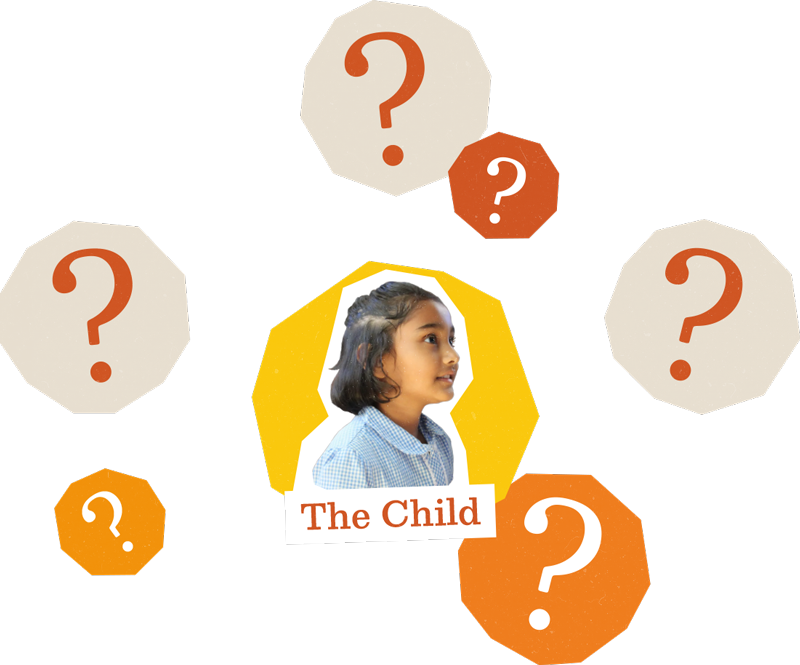
What can we know about the workforce of professionals around a child?
Why we set out to map the children’s workforce
The above are some of the questions we faced as we launched the Centre for the Children’s Workforce in late 2025.
We were incubated within the Reach Foundation, developing originally out of Reach’s early years workforce development work in South West London, which followed the Foundation of Reach Academy, an all-through school. Because of that, we felt like we had a good sense of early years and the wider education landscape and some of the workforce challenges, but had far less exposure to the rest of the system.
We knew that if we were to speak credibly to this workforce as a whole, and resist defaulting to the boundaries of well-defined, internally coherent sectors, we needed to start building the kind of cross-sector picture that, to our knowledge, hasn't existed publicly since the Children's Workforce Development Council closed in 2012.
What we can see shapes what we can plan for, invest in and value.
This reflects an understanding that what we’re working on is ultimately a framing challenge. It is a provocation to re-draw the boundary around the systems supporting children in order to create a more meaningful picture of the worlds that children and their families actually live in. On this basis, what we can see shapes what we can plan for, invest in and value.
The map we didn’t make
We’d long been talking about a piece of mapping that could increase our own understanding of this workforce, and also be used as a resource to start a different kind of conversation about the potential power in cross-sector workforce development.
As such, from the beginning the map was intended to provoke as much as to inform, and that spirit has run through its development.
Inspired by Year Here’s Golden List map of social impact careers (the former now closed and the latter not online, sadly), we’d initially imagined it being an interactive resource that demonstrated career paths through work with children. This would be something that could support people to plan a career that wasn’t dictated by vertical progression in sector siloes.
Increasingly though, in conversation with ImpactEd Group, we realised this first piece of work needed to be more foundational: building an understanding of what is actually known nationally about who does this work, and through which bodies and institutions, and what that picture could tell us about the wider space.
What the map shows (and doesn’t)
The result is a first crack at a national Map of the Children's Workforce in England.
It draws on the latest published data across seven sectors, and counts people for whom work with children is a primary or significant part of their role.
As far as we know, it is the first interactive map of the whole children's workforce (though we'd be glad to be pointed towards existing work).
The map has five views:
The Connected System groups the workforce by the functions it serves rather than the sectors it's counted in.
The Sector Overview shows the same workforce the way the data is collected: by sector.
The Local Snapshot shows an illustrative place.
The Data Gaps view shows what can't yet be counted.
The Method Statement sets out how the map was built and the judgements behind it. Every figure carries a confidence rating: strong, partial or absent. (ImpactEd's piece, published alongside this one, explains how those choices were made.)
We're proud of the map, and are pleased to be sharing it for discussion and reflection.
We also share it with an awareness that every map is a simplification. It is useful precisely because it leaves things out, and misleading when we forget that it does. That is the old idea behind the phrase "the map is not the territory", and it is the one we kept returning to as this work took shape.
What resulted makes the gap between the map and the territory unusually plain.
The map shows what gets counted, not what actually happens around children… it tells us something about what the national system can see, and what it can't.
It shows what gets counted, not what actually happens around children. Some roles are counted precisely, others are estimated within wide ranges, and some, often the ones that sit between services, aren't counted at all.
We think the best way to view the map, to grasp these tensions, is to start with the Connected System, then go straight to the Data Gaps. The map is a partial picture, but read alongside what's missing, it tells us something about what the national system can see, and what it can't.
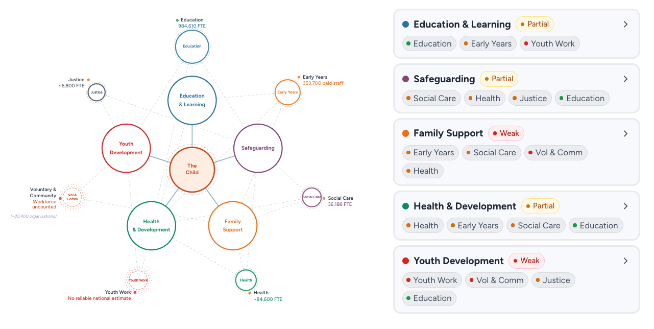
The map was developed to provoke as much as to inform.
What we’re taking forward
Three things stand out to us when we look at this map, and these are the three things we are carrying forward:
1. We can’t yet count everything that matters
To us, this map is as striking because of what it can’t show as what it can.
From the broadest view, we see a two million-strong workforce surrounding children; safeguarding them, tending to their health, well-being and learning, offering space for development, skills and belonging.
That is a significant body of support, but two million is a very tentative estimate – one that could be much higher depending on what the dark spots of the picture hold.
Education, for example, is in sharp focus in the data, and roles there represent over half of all work with babies, children and young people.
Meanwhile, the roles like youth work and voluntary sector spaces are extremely hard to see at a national level, almost invisible.
And yet clearly, this part of the workforce provides an enriching connective tissue between services, institutions, and in key parts of a child’s life and experiences, and may be best-placed to support children most holistically.
What’s more, some of the sector-level data we have used may double count individuals where roles span sectors; the available data mixes headcount and full time equivalent; and some parts of the workforce are not counted at all.
We think a deeper national understanding of these gaps and how they relate to each other will light up vital veins of support for babies, children and young people that otherwise risk going unseen and under-valued.
2. The more local the view, the better
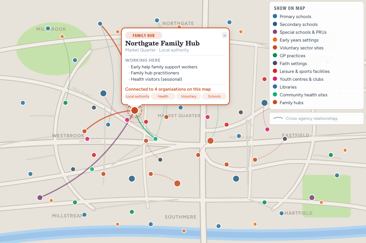
The ‘local snapshot’ view of the map shows what’s possible when the organisations in a place gather together the information they already hold.
This map is a national picture of the children’s workforce in England, which is partial and broad brush, only takes us so far into how the services and systems are experienced by children day-to-day.
We feel the big opportunity is understanding how this workforce is playing out in place – the communities and neighbourhoods where children grow up.
That’s why we developed the map’s ‘Local Snapshot’ view. This is a hypothetical: right now, no local area in England can currently see its children's workforce in this much detail, because most of it is not collected nationally in any geography.
But what if that changed? What if local children’s services had a clearer view of who was providing the formal and informal support around children in their community?
We recently started working with a local Director of Children’s Services on such an exploration, and next year will bring leaders and practitioners in the county’s children’s workforce together in order to test, learn and design new ways of working around children’s needs.
We think if regions and localities set out to map the shape of child support at a more local level, this will reveal opportunities to create a more joined-up and skilled workforce with the child at its centre.
3. Respect the parts, celebrate the whole
The Centre for the Children’s Workforce exists because we think that children will be best served if everyone working with children saw themselves as one connected workforce.
So, when we decided to add five ‘functions’ to the map – Safeguarding, Health and Development, Education and Learning, Youth Development, Family Support – we felt a tension emerge. Are we drawing arbitrary silos that over-simplify? After all, every person working with a child has safeguarding responsibilities – to name just one example.
The choice comes back to one of our guiding principles: differentiated responsibility, shared accountability. That means treating the workforce as one body, working together with the child at its heart, while respecting what boundaries and specialisms do offer that whole.
Looking by function also raises questions about where the system's attention and resources flow. Education roles are counted in detail, while much of family support, from family support workers to family hub staff, remains an unknown quantity. We wonder what that does over time: When one part of the system is the most visible, does it become the default place where new responsibilities land? And if so, is that always the best thing for children?
And because education roles and settings are so seen and known, does this mean they are absorbing more and more roles and responsibilities beyond their core function? And is this the best choice for children?
We don't know the answers yet. But we think shared accountability might mean responsibly following what children need, rather than what the system can see. Holding the parts and the whole together could be one way to tell the difference. And it allows us to see whether or not our systems and structures are balanced and responsive – in line with children’s varying needs.
Tell us what you see
This map is shared as a first step, not a finished account. It's the opening stage of a longer piece of work, and next year we hope to complement it with more detailed local mapping in a small number of places.
We also want this map to start conversations, and have a life, far beyond the boundaries of our own project.
Over the autumn we'll be publishing a series of reflections and responses from leaders and practitioners across education, early years, health, social care, youth work and youth justice, and civil society. To hear about those when they are published, sign up for emails from us below, or follow us on Linkedin.
What we hope for most is that individuals from across the workforce see something we haven’t – a question, an insight, and argument to help push its usefulness further. If you’re reading this, that means you.
Tag us on Linkedin with any perspectives you want to share: Centre for the Children's Workforce.
Do you have a response to the map that you’d like to share on our journal? Contact our comms lead katy@childrensworkforce.org.uk.