
Seeing the parts that no one counts
By Elin de Zoete and Holly Waddell
Our Map of the Children’s Workforce was designed to offer a one workforce view of professions that span a child’s life and development. Here, Elin de Zoete, Group Director, and Holly Waddell, Associate Director at ImpactEd Group, who partnered with the Centre to build the Map, reflect on the tasks and tensions of counting the children’s workforce.
Every school in England has to have a designated safeguarding lead.
It is a legal requirement, the role carries real responsibility for children at risk, and there are thousands of people doing it.
Yet no national dataset counts them. Nobody can tell you how many there are, where they are, or how much of the week they actually spend on the role.
We spent much of this year looking for the children's workforce in published data, and that is the kind of thing we kept finding.
We partnered with the Centre for the Children's Workforce to build a national map of this workforce. The Centre's case is that children are better served when everyone working with them sees themselves as one connected workforce, with differentiated responsibility and shared accountability.
It is much more difficult to make that case, or to test it, when nobody can see the workforce it describes.
Around two million people in England work primarily with children and young people yet until now there has been no single view of who they are, where they are, or how their roles connect. We set out to change that.
The task of defining ‘the children’s workforce’
This work ran in two stages.
The first was a review of what national data exists across seven sectors, covering education, early years, children's social care, health, youth work, voluntary and community, and justice.
For each sector we mapped the available datasets against six things a workforce map would want to know: from headcount and demographics through to pay, qualifications, progression and recruitment.
We recorded the smallest geography each dataset reaches and rated its quality as good, partial or poor. That review told us what the Map could attempt to show.
Alongside this review, we worked with the Centre on defining who counts as ‘the children’s workforce’. It’s not a simple question, and the act of defining it felt freighted, but we needed to draw a line around the territory at some point.
We settled on including only people for whom supporting, educating, caring for or safeguarding children is a primary or significant part of the role. That means we include teachers, health visitors, youth workers and early years practitioners (for example) inside the count.
Meanwhile, GPs, police officers and housing officers (for instance) are part of a wider workforce that forms the system around a child but is not counted here. These judgement calls have fundamentally shaped the work.
The Map that we developed from this definition of the children’s workforce has five views: how the workforce connects, the detail behind each sector, what a single local area looks like once its workforce has been mapped, what is missing and why, and a statement of the sources and the decisions.
Every figure carries a confidence rating and every dataset its own publication date, because they do not share a timepoint. The Map makes a series of contestable judgements and we built it to be argued with.
Many sectors, many functions, one workforce
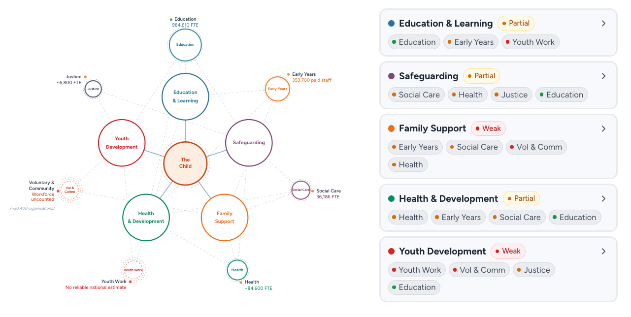
The ‘Connected Workforce’ view of the map shows the connections between functions and roles.
Another defining judgement call was how we organised what we found. Every national dataset that touches this workforce is organised by sector: the School Workforce Census counts school staff, the Children's Social Work Workforce return counts social workers, and NHS Digital counts NHS employees.
That is because data collection follows accountability, and accountability is arranged by sector, so any analysis built from published sources has to be built that way too.
However, the Centre's view was that a workforce presented as seven sectors reinforces the siloes the Centre exists to dissolve. Someone who arrives at a seven-part diagram learns that the workforce is seven things, which is the opposite of what the Centre is trying to say.
Instead, we counted by sector but presented by function. The front of the Map is built from looking at what a role does for the child rather than who employs it. So, it shows five groupings: education and learning, safeguarding, family support, health and development, and youth development.
That means a school nurse sits in health and development and in safeguarding. A designated safeguarding lead, the role we started with, sits in education and learning and in safeguarding. The seven sectors sit on the outer ring, feeding in.
The five groupings are ours and the Centre's, and they are not anyone's official taxonomy. Someone who has spent twenty years in this system may group the same roles quite differently, and the boundaries between the groupings are as arguable as the sector boundaries they replace.
We took the decision that it is more useful to discuss and debate those groupings, than to publish a diagram that reinforces less helpful delineations.
A data gap speaks a thousand words
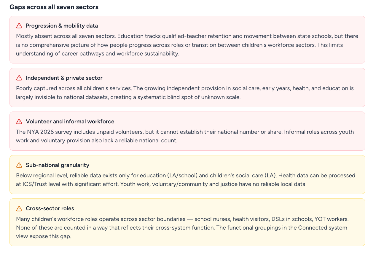
We found many significant gaps in what we can know about the children’s workforce.
A useful issue the Map exposes is where the evidence stops. Progression and mobility are weak or absent across all seven sectors. Nothing that is published tracks how people move between roles, between employers or between sectors.
The Centre makes a case for people being able to build a career across a connected sector, but currently national datasets don’t enable anyone to say how much movement there is or whether such a career is possible.
If you have ever tried to move from family support into youth work, or from early years into a school, you know more about this than the national data can portray.
Other gaps show consistent patterns. The roles counted least well are the ones sitting between accountable bodies, because data collection follows accountability and these roles have no single body accountable for them. That is why the designated safeguarding lead is invisible, and why the voluntary and community workforce is extremely difficult to quantify on the Map.
The local view in the Map is illustrative rather than a real area because no single area currently holds all of this data together in this way. It shows what would become visible when the organisations in a place contribute what data they already hold. Taking that focused approach with a real local authority and its partners is the work we are most interested in next.
A conversation-starter, not the final say
We have tried to make the reasoning behind decisions we made in developing the Map visible alongside the result.
If you work in this system and think we have drawn a boundary in the wrong place, counted something that should not be counted, or missed something that should be, we would like to hear and discuss it.
That way we can facilitate better shared understanding of the children’s workforce across an interconnected system – this is exactly what the Map is for.
Over the autumn we'll be publishing a series of reflections and responses from leaders and practitioners across education, early years, health, social care, youth work and youth justice, and civil society. To hear about those when they are published, sign up for emails from us below, or follow us on Linkedin.
Tag us on Linkedin with any perspectives you want to share: Centre for the Children's Workforce.
Do you have a response to the map that you’d like to share on our journal? Contact our comms lead katy@childrensworkforce.org.uk.